
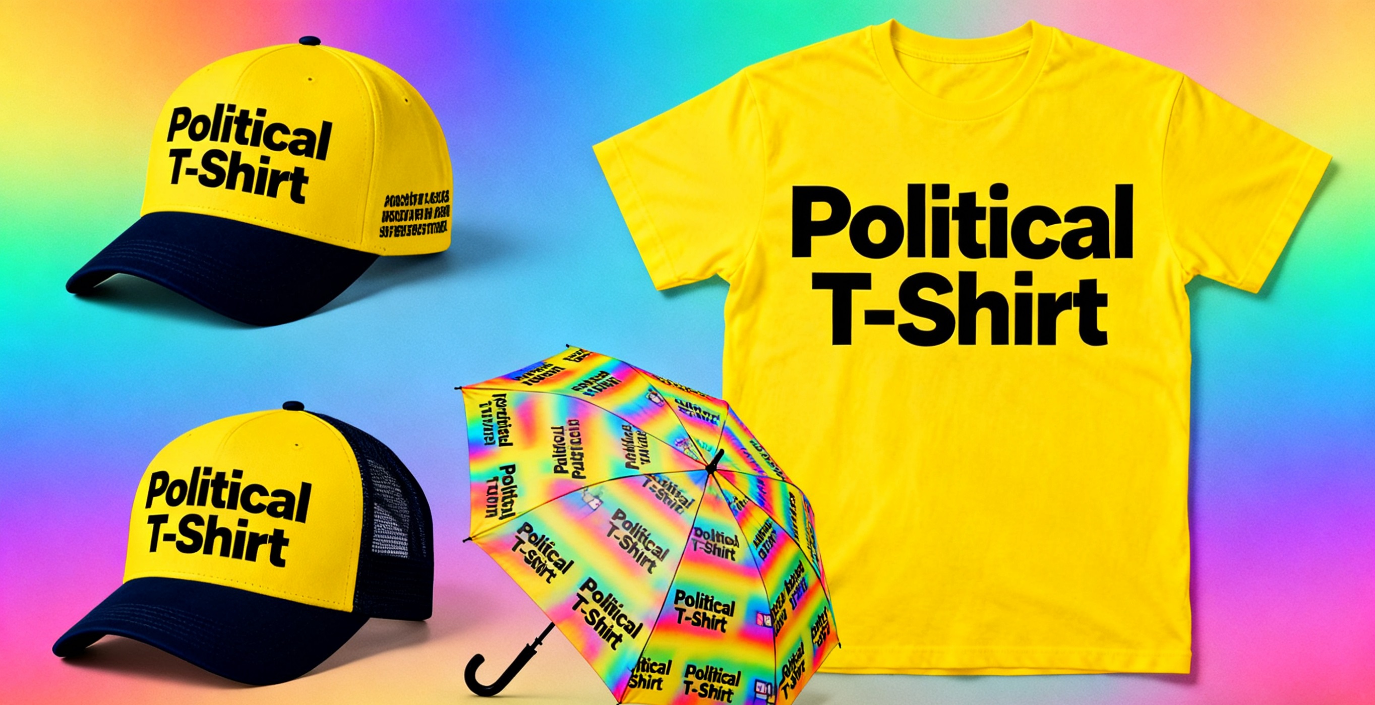
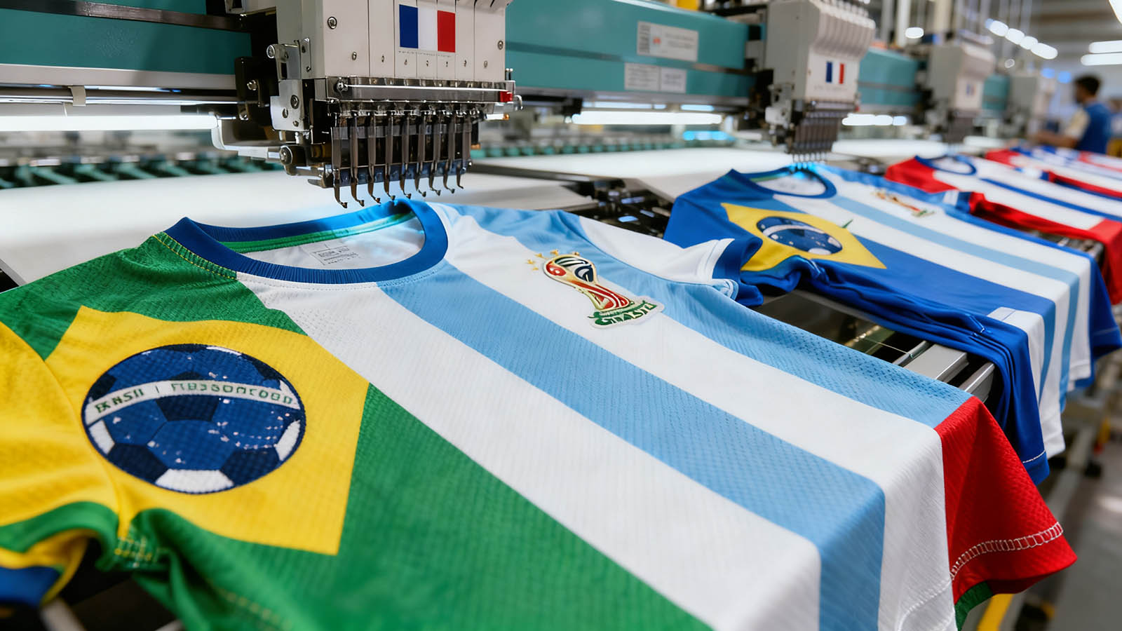
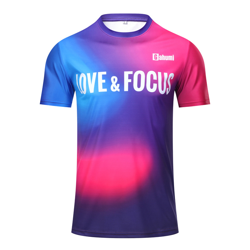
 Tshirt
 Custom Hoodie & Sweat
 Custom Bags
 Flag
Flag
 Towel
Towel
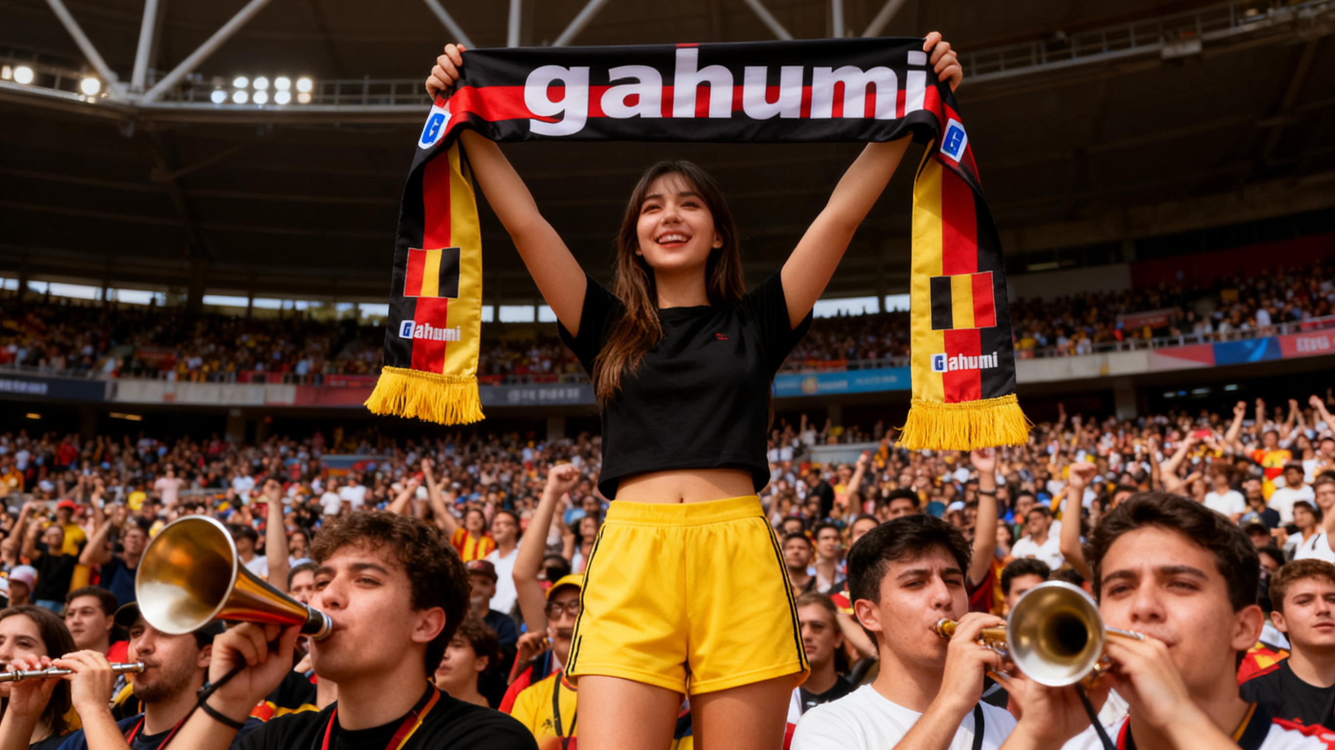
 Custom Scarf
 Cap
Cap
The Strategic Application of Color Psychology in Election T-Shirt Design
In the visually saturated landscape of political campaigning, color serves as one of the most immediate and potent tools for communication, emotional connection, and brand differentiation. The strategic selection of colors for election t-shirts transcends mere aesthetic preference, representing instead a sophisticated marketing decision that can significantly influence voter perception, campaign messaging, and overall political brand identity. As an established Custom Election T-shirt OEM manufacturer, Gahumi recognizes that color choices directly impact manufacturing processes, cost structures, and final product quality. This comprehensive analysis examines the psychological underpinnings of color perception in political contexts and provides actionable strategies for optimizing color selection to advance campaign objectives while accommodating practical manufacturing considerations.
The Neuroscience of Color Perception in Political Contexts
Pre-Cognitive Color Processing and Emotional Priming
Human brains process color information before consciously registering content or context, making color selection a crucial factor in establishing immediate emotional connections with potential voters. Neuroscientific research demonstrates that specific wavelengths of light trigger distinct neurological responses that bypass rational processing and directly influence emotional states. For political campaigns, this means that t-shirt colors can prime voters to receive messages with greater receptivity before they even read slogans or process candidate information. The amygdala—the brain's emotional center—activates within milliseconds of color exposure, creating visceral reactions that later rational processing must either reinforce or overcome. This understanding explains why consistent color application across all campaign materials, including apparel, creates stronger brand recognition and more reliable emotional responses than constantly changing color schemes that require renewed neurological adaptation with each exposure.
Cultural and Demographic Color Associations
While certain color responses are neurologically universal, many associations are culturally constructed and demographically specific, requiring careful consideration of target voter populations. The same color that signals trust and reliability in one cultural context may communicate mourning or danger in another. Sophisticated campaigns analyze their constituent demographics to identify color associations that resonate with specific age groups, ethnic communities, and regional populations. For example, while blue consistently rates as a favored color across most demographics, its specific shades carry different connotations—lighter blues may appeal to younger voters seeking innovation, while navy blues reassure older constituents valuing tradition and stability. These nuanced understandings enable campaigns to select color palettes that strengthen connections with target voters while avoiding unintended negative associations that could undermine campaign messaging
Strategic Color Applications in Election T-Shirt Design
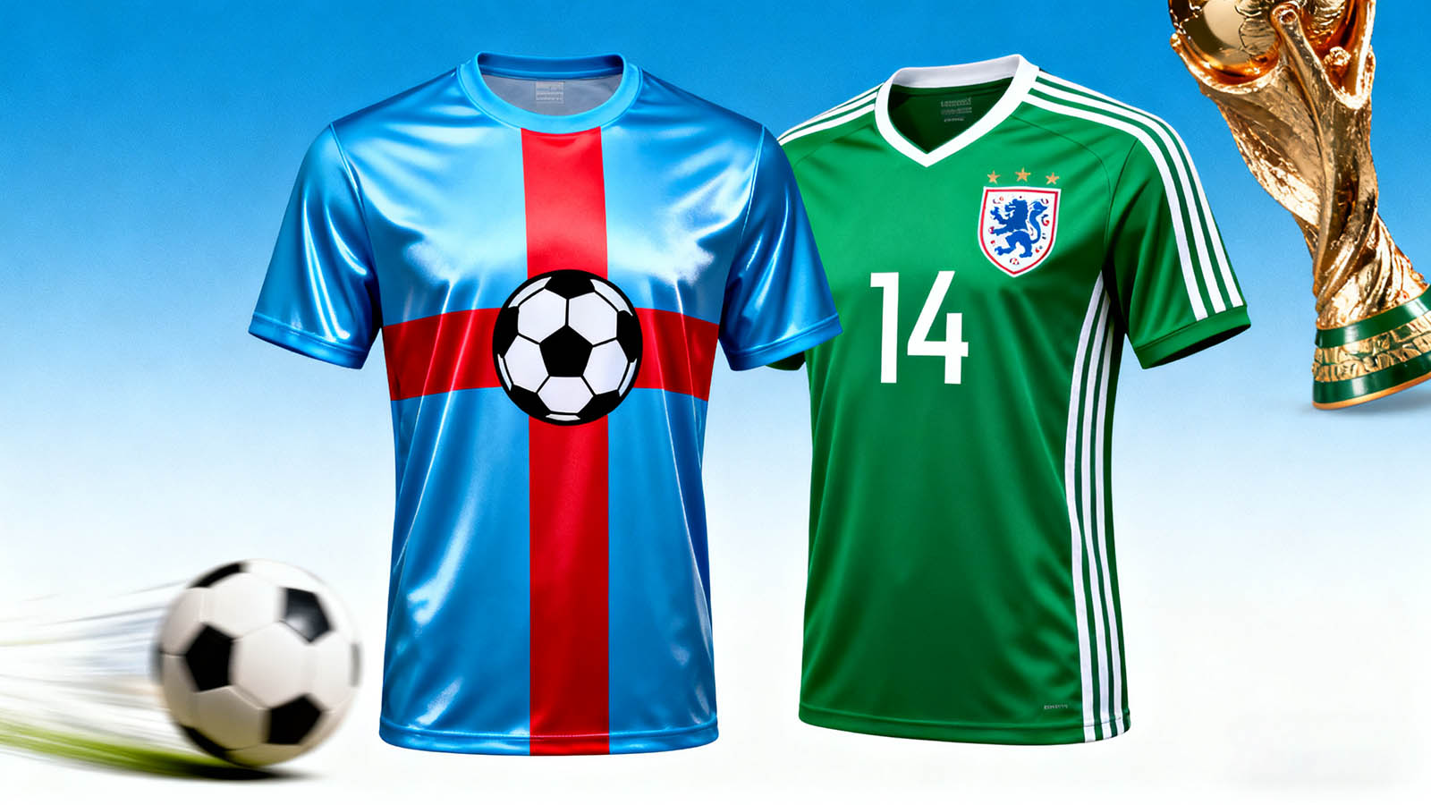
Red: Energy, Urgency, and Political Activation
Red occupies a unique position in political color psychology, simultaneously signaling urgency, action, and traditional political affiliation in many Western democracies. Physiologically, red wavelength light increases heart rate and respiration, creating sensations of excitement and immediacy that can motivate voter turnout and campaign engagement. For conservative campaigns, red often reinforces traditional values, patriotic fervor, and political party affiliation. For progressive movements, red can communicate revolutionary change, passionate advocacy, and urgent action requirements. Beyond its political connotations, red possesses exceptional visibility in crowded environments, making it strategically valuable for rallies, public events, and any context where standing out visually supports campaign objectives. However, red's intensity requires careful balancing through neutral companions and considered application to prevent visual fatigue or association with aggression rather than positive energy.
Important Note: Red tends to appear more vibrant when screen printed but may require underbasing on darker garments, affecting both production cost and final hand feel.
Blue: Trust, Stability, and Professional Authority
Blue consistently ranks as the most universally favored color across demographic groups, making it a strategically safe yet powerful choice for election t-shirt designs. Psychological studies repeatedly demonstrate that blue environments and visuals increase perceptions of trustworthiness, dependability, and professional competence—attributes highly valuable in political contexts where credibility concerns often determine electoral outcomes. Different shades of blue communicate distinct nuances: navy blue conveys traditional authority and established leadership, while brighter blues suggest innovation, transparency, and forward-thinking approaches. Light blues often appeal to younger voters and communities seeking political renewal rather than established systems. Blue's versatility makes it equally effective as a primary color or complementary accent, providing design flexibility while maintaining core associations with trust and stability that benefit most political positions and messaging strategies.
Purple: Bipartisanship, Innovation, and Niche Positioning
Purple's relative rarity in political branding makes it strategically valuable for campaigns seeking to position themselves as innovative, bipartisan, or distinct from established political binaries. As a blend of traditionally partisan red and blue, purple naturally communicates reconciliation, collaboration, and transcendence of political divisions. This makes it particularly effective for independent candidates, unity-focused messaging, and campaigns targeting disillusioned voters weary of partisan conflict. Purple's historical association with royalty and exclusivity lends an air of premium quality and distinctive thinking when applied to political branding. Additionally, purple possesses strong connections to creativity and visionary thinking, benefiting campaigns centered on innovative policy proposals or non-traditional political approaches. While purple requires more careful demographic consideration than primary colors, its distinctive qualities offer significant advantages for appropriately positioned campaigns.
Green: Growth, Environmentalism, and Natural Authenticity
Green occupies an increasingly important position in political color psychology, particularly as environmental concerns move from niche issues to mainstream political priorities. The color's fundamental associations with nature, growth, and life make it naturally appropriate for campaigns emphasizing environmental protection, sustainability, and ecological awareness. Beyond environmental messaging, green communicates balance, renewal, and organic development—valuable associations for campaigns positioned as refreshing alternatives to established political systems. Green's psychological effects include reducing stress and creating sensations of harmony, potentially making campaign messages feel more accessible and less confrontational. The color's financial associations also benefit campaigns focused on economic growth, responsible fiscal management, or prosperity-oriented messaging. Green's versatility across these domains makes it strategically valuable for increasingly diverse political applications.
Technical Manufacturing Considerations for Color Implementation
Color Consistency Across Production Batches
Maintaining precise color consistency across manufacturing runs presents significant technical challenges that directly impact campaign brand integrity. Variations in fabric composition, dye lots, printing techniques, and curing processes can create noticeable color differences that undermine professional presentation. As an experienced OEM t-shirt manufacturer, Gahumi implements standardized color management systems that include spectrophotometric measurement, standardized lighting conditions for visual inspection, and controlled production environments to minimize batch-to-batch variation. The Pantone Matching System (PMS) provides crucial standardization for solid colors, while customized ink formulations ensure consistent hue, value, and chroma across different garment colors and materials. These technical controls prove particularly important for campaigns producing merchandise through multiple production runs or across different manufacturing facilities while maintaining brand consistency.
Printing Method Limitations and Color Optimization
Different decoration methods present distinct color reproduction capabilities that must inform design decisions from their earliest stages. Screen printing excels at reproducing solid, vibrant colors but becomes increasingly complex and expensive with additional color counts. Direct-to-garment (DTG) printing offers photographic color range but may produce less vibrant results on darker garments without proper underbasing. Embroidery introduces texture and dimension but is limited by available thread colors and stitch density considerations. Each method requires specific file preparation approaches—vector artwork for screen printing, high-resolution RGB files for DTG, and simplified color-separated designs for embroidery. Understanding these technical parameters during the design phase prevents costly revisions and ensures final products accurately reflect campaign color strategy while accommodating manufacturing realities and budget constraints.
Strategic Color Implementation Framework
Competitive Color Differentiation and Market Positioning
Color selection should strategically differentiate campaigns from competitors while accurately communicating political positioning. Comprehensive analysis of opponents' color schemes identifies opportunities for visual distinction that reinforces substantive differences. In crowded primary elections, distinctive color choices help candidates stand out while signaling unique aspects of their platforms or personalities. The most effective color differentiation maintains appropriate category cues—while unusual colors attract attention, completely unconventional political color choices may confuse voters expecting certain visual conventions. Sophisticated campaigns often employ primary colors that align with voter expectations while incorporating distinctive accent colors or unique color combinations that create memorability without sacrificing immediate political recognizability. This balanced approach leverages color psychology while acknowledging practical voter expectations and category conventions.
Demographic-Targeted Color Strategies
Different voter demographics exhibit distinct color preferences and associations that inform targeted campaign apparel strategies. Younger voters typically respond more positively to brighter, saturated colors and unconventional combinations that signal innovation and departure from tradition. Older voters often prefer more subdued, classic color palettes that communicate stability and reliability. Gender differences in color preference, while culturally influenced, remain statistically significant enough to inform decisions when targeting specific gender demographics. Regional color associations vary considerably—colors associated with local sports teams, educational institutions, or natural environments can create powerful connections while colors with negative regional associations should be carefully avoided. These demographic considerations enable campaigns to develop color strategies that resonate with specific target voters while maintaining core brand consistency.
Cultural and Contextual Color Considerations
Regional and International Color Symbolism
Campaigns operating in diverse geographic regions or multicultural communities must research localized color associations to avoid unintended negative connotations. While some color meanings remain relatively consistent across contexts (blue for trust, red for energy), many carry dramatically different associations in different cultural frameworks. White signifies purity and new beginnings in Western contexts but represents mourning in many Eastern cultures. Purple's royal associations in Western history contrast with its connections to religious piety in some Middle Eastern contexts. These cultural variations become particularly important for campaigns in diverse districts, presidential campaigns with national reach, or any political effort communicating across cultural boundaries. Thorough cultural research prevents color choices that inadvertently alienate significant voter segments while identifying opportunities to strengthen connections through culturally resonant color selection.
Accessibility and Inclusive Design Principles
Conscientious campaign apparel design incorporates accessibility considerations to ensure color choices communicate effectively across varying visual abilities. Approximately 8% of men and 0.5% of women experience some form of color vision deficiency that affects color perception. The most common form—difficulty distinguishing red and green—has particular significance for political color selection given these colors' traditional partisan associations. Accessibility-minded designs ensure sufficient value contrast between elements regardless of hue differences, enabling voters with color vision deficiencies to receive the intended messaging. Additionally, color should never serve as the sole means of communicating important information—text clarity, graphic distinction, and layout organization must ensure comprehensibility regardless of color perception abilities. These inclusive design principles demonstrate campaign commitment to accessibility while ensuring broader communication effectiveness.
Gahumi's Color Management Expertise in Political Apparel Manufacturing
Technical Color Reproduction Capabilities
As a specialized Custom Election T-shirt OEM manufacturer, Gahumi maintains advanced color management systems specifically optimized for political campaign requirements. Our technical capabilities include precise Pantone color matching across different garment materials and colors, specialized ink formulations for optimal vibrancy and durability, and controlled production environments that ensure color consistency across manufacturing runs and production facilities. Digital color management workflows maintain color integrity from initial design through separation, proofing, and production, preventing unexpected color shifts that could compromise campaign branding. These technical capabilities prove particularly valuable for campaigns requiring exact color matching to existing branding elements or coordinating apparel with other campaign materials produced through different manufacturing processes.
Strategic Color Consultation Services
Beyond technical execution, Gahumi provides strategic color consultation that helps campaigns optimize their color selections for both psychological impact and manufacturing efficiency. Our expertise encompasses color trend analysis within political contexts, demographic-specific color recommendations, and technical guidance regarding color reproduction across different decoration methods and garment types. We help campaigns identify color strategies that balance distinctiveness with appropriate political category cues, ensuring colors attract attention while maintaining necessary associations with leadership, trust, and capability. This consultative approach prevents costly design revisions by addressing potential manufacturing challenges during the design phase while ensuring final apparel products accurately reflect and advance campaign strategic objectives through optimized color implementation.
Frequently Asked Questions (FAQ)
Q1: How many colors should we include in our election t-shirt designs?
A1: For screen printing, optimal color range is 1-4 colors to maintain cost efficiency and print quality. DTG printing accommodates unlimited colors but works best on light garments. Embroidery typically limits colors due to thread changes. We recommend starting with a core palette of 2-3 colors that can be expanded with accent colors for premium items.
Q2: Can you match specific brand colors across different garment colors?
A2: Yes, our color management systems ensure precise Pantone matching across different garment colors through customized ink formulations and opacity adjustments. We provide physical color proofs for approval before full production to guarantee color accuracy across all manufacturing conditions.
Q3: How does color choice affect production cost and timeline?
A3: Additional colors increase screen printing costs through separate screen requirements and longer production times. Complex color gradients may require DTG printing with different pricing structures. Embroidery color changes add minimal cost compared to screen printing. We provide detailed cost analysis during design consultation to optimize color choices for budget and timeline.
Q4: What are the most universally appealing colors for diverse constituencies?
A4: Blue consistently rates as the most universally favored color across demographics. Navy blue appeals broadly across age groups, while brighter blues attract younger voters. Red works effectively for base mobilization, while purple offers distinctive positioning for campaigns targeting independent voters.
Q5: How do we ensure our colors remain consistent across reorders?
A5: We maintain detailed color formulas, production records, and retained samples for all orders. Our digital color management systems ensure batch-to-batch consistency, while standardized production processes prevent variation. We recommend ordering buffer inventory to avoid potential color shifts between separate production runs.
Q6: What sustainable color options are available?
A6: We offer water-based inks, discharge printing, and eco-friendly pigments that maintain color vibrancy while reducing environmental impact. These options provide excellent color reproduction while aligning with sustainability values increasingly important to modern voters.

.webp)
.jpg)
.jpg)
.jpg)
.jpg)
.jpg)
.jpg)