In the world of political movements, a single phrase—when paired with the right typography—can spark action, unite supporters, and define a campaign. For customized election t-shirts, typography isn’t just about making text readable—it’s about turning words into a visual force that amplifies a movement’s message. A poorly chosen font can dilute even the most powerful slogan, while strategic typography can turn a simple phrase like “Vote for Justice” into a statement that demands attention. As a specialized Custom Election T-Shirt OEM/ODM manufacturer, Gahumi understands that typography is the backbone of text-based political tees. We blend design expertise with OEM/ODM precision to create private label election tees where every letter, spacing, and color serves the movement’s mission. Below, we break down how impactful typography elevates text-based election tees, Gahumi’s tailored services for typography-driven designs, and how to leverage these tees to build momentum for your political cause.
1. The Critical Role of Typography in Text-Based Political T-Shirts
Typography is the art and technique of arranging type—and for text-based political t-shirts, it’s a make-or-break element. Unlike graphic-heavy tees that rely on images to convey meaning, text-based designs depend entirely on typography to communicate emotion, urgency, and identity. The right font, size, color, and spacing don’t just make a slogan readable—they make it memorable and persuasive.
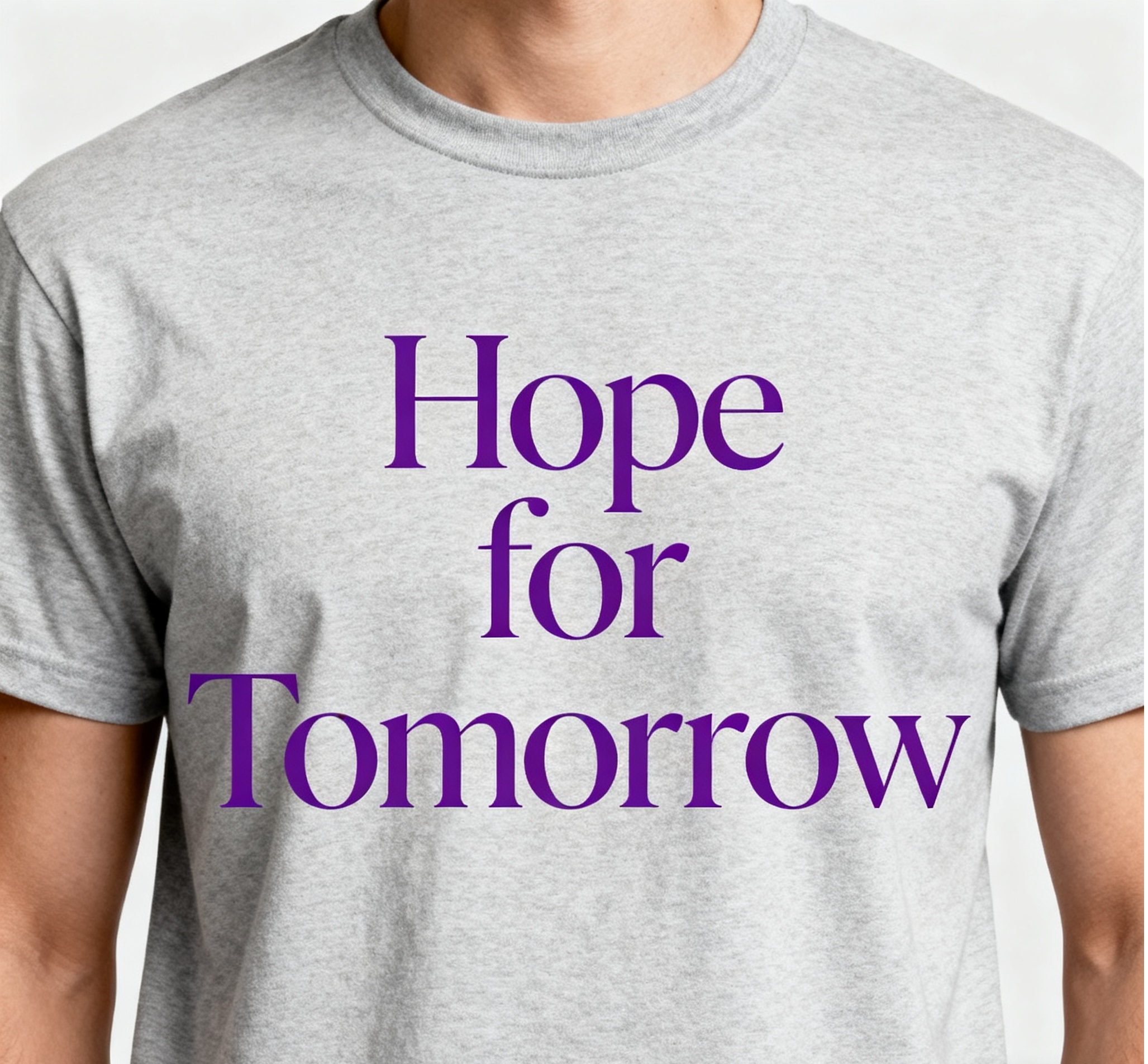
First, typography sets the emotional tone of a movement. A bold, sans-serif font (like Arial Black) conveys strength and urgency—perfect for slogans like “Act Now for Climate.” In contrast, a clean, serif font (like Georgia) feels trustworthy and timeless, ideal for messages about unity or legacy, such as “Building a Better Community.” For example, a voting rights movement might use a thick, block-style font to emphasize “Your Vote Matters”—the heavy letters signal importance, while the wide spacing ensures readability from a distance. Gahumi’s design team analyzes your movement’s core values to recommend typography that aligns with its tone, ensuring the tee doesn’t just say something—it feels something.
Second, typography drives readability and visibility—two non-negotiables for election tees. A tee worn at a rally or grocery store needs to be legible in seconds, even from across a room. Poor typography (e.g., tiny text, low-contrast colors, or overly decorative fonts) renders a slogan useless; supporters wear the tee, but no one can read the message. Gahumi prioritizes “distance readability” in all text-based designs: we use font sizes that work for different tee placements (chest, back, sleeves), pair dark text with light fabrics (and vice versa), and avoid overly stylized fonts that obscure letters. For instance, a back-print slogan like “Rally for Change” would use a 24pt sans-serif font—large enough to be read by someone walking behind the wearer, but not so big that it feels overwhelming.
Third, typography builds brand consistency for political movements. When supporters see the same font, spacing, and color scheme across all your customized election tees, they begin to associate that typography with your cause. This consistency turns individual tees into part of a cohesive brand—supporters recognize your movement at a glance, and new audiences learn to link your typography to your mission. Gahumi’s OEM services reinforce this by ensuring every tee adheres to your typography guidelines: whether you’re ordering 50 tees for a local event or 5,000 for a national campaign, the font size, color, and alignment remain identical.
The importance of typography can’t be overstated: it’s the difference between a tee that fades into the background and one that starts conversations, recruits supporters, and drives action. For political movements, that difference is often the key to building momentum.
2. Core Typography Principles for High-Impact Text-Based Election Tees (Gahumi’s Expert Framework)
Designing effective text-based election tees requires more than just picking a font—it requires following proven typography principles that prioritize message clarity and emotional resonance. Gahumi’s design team uses a four-step framework to ensure every private label election tee’s typography triumphs, whether for an OEM order (with your existing design) or an ODM project (building from scratch).
Principle 1: Font Selection Aligned with Movement Identity
The font you choose should tell your movement’s story before anyone reads the words. Gahumi categorizes fonts by “personality” to match them to your cause:
- Bold Sans-Serif Fonts (e.g., Impact, Helvetica Bold): Ideal for movements focused on urgency, strength, or change (e.g., “End Poverty Now”). These fonts have no decorative “tails” (serifs), making them crisp and easy to read at a distance. They feel modern and assertive—perfect for rallying supporters to act.
- Clean Serif Fonts (e.g., Georgia, Times New Roman): Best for movements emphasizing tradition, trust, or legacy (e.g., “Protect Our Heritage”). Serifs add a sense of stability and credibility, making them well-suited for campaigns targeting older audiences or issues tied to community history.
- Handwritten/ Script Fonts (e.g., Brush Script, Lobster): Great for grassroots movements or causes focused on empathy (e.g., “Care for Our Neighbors”). These fonts feel personal and approachable, like a handwritten note—they build emotional connection and signal authenticity.
Gahumi’s ODM team avoids “decorative overload”: overly fancy fonts (e.g., overly curly scripts or distorted display fonts) may look eye-catching, but they often make text unreadable. For example, a slogan like “Vote Local” in a highly stylized font might be mistaken for “Vote Lock”—undermining your message. We test fonts for readability first, then for style, ensuring form follows function.
Importance: Font selection is the foundation of typography—choose the wrong one, and even the best slogan will fail to resonate. Gahumi’s expertise ensures your font matches your movement’s identity and goals.
Principle 2: Color Contrast for Maximum Visibility
Typography isn’t just about shape—it’s about color. A slogan’s text color and the tee’s fabric color must create enough contrast to be readable in all settings (sunlight, indoor events, dimly lit rooms). Gahumi follows the “70% contrast rule”: the difference in lightness between text and fabric should be at least 70% (measured using industry-standard tools like the WCAG contrast checker).
Common high-contrast pairings Gahumi recommends for text-based election tees include:
- White text on black, navy, or forest green fabric (classic, high-visibility for rallies).
- Black text on white, light gray, or pastels (clean, modern for everyday wear).
- Bold accent colors (red, yellow) on neutral fabrics (gray, beige) for key phrases (e.g., highlighting “NOW” in “Act Now” with red text).
We avoid low-contrast pairings that hinder readability: light gray text on white fabric, yellow text on beige fabric, or dark blue text on black fabric. For example, a movement using “Climate Action” in light blue on a navy tee would struggle to get its message across—passersby might see the tee but not the slogan. Gahumi’s OEM process includes a contrast check for every design, ensuring your text stands out in any environment.
Importance: Even the best font is useless if no one can read it. Contrast ensures your message is visible, turning supporters into effective ambassadors.
Principle 3: Hierarchy to Guide the Eye
Text-based election tees often include multiple elements: a main slogan, a secondary message (e.g., a campaign date), and a movement name or logo. Typography hierarchy ensures viewers read these elements in the right order—focusing first on the most important message, then on supporting details. Gahumi uses three tools to create clear hierarchy:
- Font Size: The main slogan (e.g., “Fight for Fair Wages”) uses the largest font (20–28pt for chest prints, 24–36pt for back prints). Secondary text (e.g., “Rally: Oct 15”) uses a smaller font (12–16pt), and movement names/logos use a medium size (16–18pt) to tie everything together.
- Font Weight: The main slogan uses a bold or black weight, while secondary text uses a regular or light weight. This difference in thickness draws the eye to the most critical message first.
- Spacing: We add extra spacing (kerning) around the main slogan to make it stand out, and reduce spacing between secondary text to group related information (e.g., “Rally: Oct 15 | City Hall” stays tightly spaced to show it’s a single detail).
For example, a Gahumi-designed tee for a housing justice movement might feature:
- Main slogan: “Homes for All” (24pt, bold sans-serif, white text on navy fabric).
- Secondary text: “Volunteer” (14pt, regular sans-serif, white text).
- Movement logo: “Housing Justice Coalition” (18pt, semi-bold sans-serif, white text).
This hierarchy ensures viewers first see the core mission (“Homes for All”), then learn how to take action—exactly the sequence a movement wants to drive.
Importance: Hierarchy prevents information overload. It ensures your most important message doesn’t get lost, guiding supporters and onlookers to act.
Principle 4: Spacing (Kerning, Leading, Tracking) for Readability
Spacing—often overlooked—has a huge impact on how easy text is to read. Gahumi pays meticulous attention to three key spacing elements:
- Kerning: The space between individual letters. Poor kerning (too tight or too loose) can make text look unprofessional or hard to parse. For example, “VOTE” with tight kerning might look like “V0TE,” while loose kerning might make it look disjointed. Gahumi adjusts kerning for each font, ensuring letters flow naturally.
- Leading: The space between lines of text. For tees with multiple lines (e.g., a main slogan and a secondary message), leading ensures lines don’t overlap or feel cramped. We use leading that’s 120–150% of the font size (e.g., 24pt text uses 28–36pt leading) to keep text breathable.
- Tracking: The overall space between all letters in a phrase. For long slogans (e.g., “We Stand Together for Educational Equity”), Gahumi uses slight tracking (expanding the space between all letters) to prevent text from feeling crowded, especially on wide tee surfaces like the back.
For example, a long slogan like “Justice for Every Community” would need adjusted tracking to ensure it fits comfortably across a tee’s chest without feeling squished. Gahumi’s design team tests spacing on physical tee samples, not just digital previews—this ensures the text looks balanced when worn, not just on a screen.
Importance: Spacing is the “hidden” element of typography. It makes text feel intentional and easy to read, preventing frustration and ensuring your message is absorbed quickly.
Gahumi’s Custom Election T-Shirt OEM/ODM services are designed to turn your typography vision into high-quality, movement-ready tees. Whether you have a fully developed design (OEM) or need help crafting typography from scratch (ODM), we prioritize precision, consistency, and alignment with your movement’s goals.
If your movement already has a typography-approved design (e.g., a slogan with a specific font, color, and spacing), Gahumi’s OEM services ensure flawless production. Our process focuses on preserving the integrity of your typography—no shortcuts or compromises.
First, we conduct a typography audit of your design. Our team checks font files (ensuring we have the correct license to use them), verifies contrast ratios, and tests spacing to ensure it translates well to fabric. For example, if your design uses a custom font that’s not compatible with our printing software, we work with you to find a matching alternative that maintains the original look. We also adjust for “fabric shrinkage”: some fabrics (like cotton) shrink slightly after washing, so we scale fonts by 2–3% to ensure they stay proportionate post-wash.
Next, we offer material matching to enhance your typography. The right fabric can make text pop: smooth cotton blends work best for crisp screen-printed typography, while heathered fabrics add texture that complements subtle script fonts. Gahumi provides fabric samples so you can see how your typography looks on different materials—for example, a bold white slogan on a heathered gray tee might have a softer, more approachable feel than on a solid white tee.
Finally, we implement batch consistency checks. For large OEM orders, we print a sample tee from the first batch, review it for typography accuracy (font size, color, spacing), and get your approval before proceeding. This ensures every tee in your order—whether it’s the 10th or the 1,000th—matches your design exactly.
Key Benefit for Movements: OEM services let you retain full control over your typography while leveraging Gahumi’s production expertise. This is ideal for movements with established brands that need consistent, high-quality tees.
If your movement is starting without a typography design (or wants to refine an existing concept), Gahumi’s ODM services are the solution. Our design team collaborates with you to create typography that aligns with your mission, audience, and goals—turning vague ideas into impactful text-based tees.
The ODM process starts with a mission alignment call. We ask questions like: What’s the core message of your slogan? Who is your target supporter (youth, working professionals, rural communities)? What tone do you want to convey (urgent, hopeful, unifying)? For example, a youth-led climate movement might want typography that feels bold and modern, while a senior advocacy group might prefer something timeless and trustworthy.
Next, we create 3–4 typography concepts. Each concept includes a different font, color palette, and spacing, with explanations of how it aligns with your mission. For example, one concept for a “Vote Youth” movement might use a bold sans-serif font in neon green (modern, energetic), while another uses a clean script font in navy (approachable, inclusive). We provide digital previews and physical samples of each concept, so you can see how the typography looks on a real tee.
Once you select a concept, we refine it with feedback loops. If you want to adjust the font weight, change the text color, or tweak spacing, we revise the design and provide a new sample—no extra cost. We also add private label elements (custom neck tags with your movement’s name, hang tags with typography guidelines) to reinforce brand consistency.
Finally, we test the design for real-world use. We wash the sample tee multiple times to ensure the typography doesn’t fade or crack, and we have team members wear it in different settings (rallies, offices, outdoor events) to test readability. Only when the design meets our high standards do we move to full production.
Key Benefit for Movements: ODM services take the guesswork out of typography. Gahumi’s design expertise ensures your text-based tee is not just readable—but impactful.
Gahumi’s private label election tee services let you add typography-driven branding elements that make your tees feel exclusive and memorable. These details reinforce your movement’s identity and turn tees into collectible items that supporters wear with pride.
- Custom Neck Tags: We print neck tags with your movement’s name (in your approved typography) and a short mission statement (e.g., “Fighting for Equity Since 2024”). Neck tags are sewn into the tee, so every time a supporter puts it on, they’re reminded of your cause.
- Hang Tags: Hang tags feature your slogan (in full typography) and a QR code that links to your movement’s website or volunteer page. They’re attached to the tee’s neckline, so even before the tee is worn, it’s spreading your message.
- Sleeve Prints: For extra visibility, we add small typography elements to the tee’s sleeve (e.g., a mini version of your movement’s name or a key phrase like “Justice”). Sleeve prints are subtle but effective—they catch the eye when supporters move their arms.
For example, a private label election tee for a “Fair Tax” movement might include:
- Neck tag: “Fair Tax Coalition” (in the movement’s serif font).
- Hang tag: “Tax Justice for All” (full slogan, bold sans-serif) + QR code to fairtax.org.
- Sleeve print: “Fair Tax 2026” (mini typography, matching the hang tag font).
These details turn a simple tee into a cohesive brand asset—supporters feel like they’re part of an exclusive community, and onlookers get multiple touchpoints with your typography and message.
Importance: Private label elements extend the impact of your typography beyond the tee’s main design. They turn tees into multi-channel marketing tools that reinforce your movement’s identity.
A great typography-driven election tee is only effective if you use it strategically. Gahumi’s tees are designed to be versatile—they work for rallies, volunteer events, social media, and everyday wear. Below are four tactics to maximize the impact of your text-based tees.

 Tshirt
 Custom Hoodie & Sweat
 Custom Bags
 Flag
Flag
 Towel
Towel
 Custom Scarf
 Cap
Cap
.webp)
.jpg)
.jpg)
.jpg)
.jpg)
.jpg)
.jpg)